Designs for Living: The Bold & The Beautiful

In the early 2020s, we’re starting to see warmer undertones for whites and other neutrals, with beige replacing grey, for example, and pops of saturated colour in browns, reds and greens. Photo: Stacey Brandford
Stark minimalism is giving way to over-the-top maximalism,
with vibrant colour and fabulous wallpaper.
Get ready to go big at home, because saturated colour and exuberant patterns in decor are back, baby! It’s been more than a decade since American interior designer and Fixer Upper star Joanna Gaines started spreading her spare, farmhouse-style gospel, with its white interiors and black accents (especially in kitchens), adorable graphic vintage signs and shiplap walls, but now the era of crisp and minimalist homes is on the wane.
The new look owes a debt to fashion, namely former Gucci designer Alessandro Michele’s too-too-much-much mashup of bold colours, imagery and textures. Translated to decor, it means bold wall colour is replacing the ubiquitous neutrals of the 2010s, with a return to wallpaper and over-the-top murals. The pinnacles of this new style are evident in the new restaurant Bacchanalia in London’s Mayfair district, with its Greco-Roman inspired cacophony of hand-painted, floor-to-ceiling murals, mixed with ancient antiquities and British artist Damien Hirst’s massive statues of Greek mythological figures. In Paris, the new maximalist standard is being set by Hotel Les Deux Gares, a small but influential project designed by British colour enthusiast Luke Edward Hall, with its chaos of bold colour bursts and madcap stripes. And in Toronto, the 135-year-old Darling Mansion is an event space described as “a Victorian mansion meets Dali, a little Fellini, some ’70s porn and a lot of rock ’n’ roll,” which translates into a decorative carnival of colour, taxidermy and trompe l’oeil.
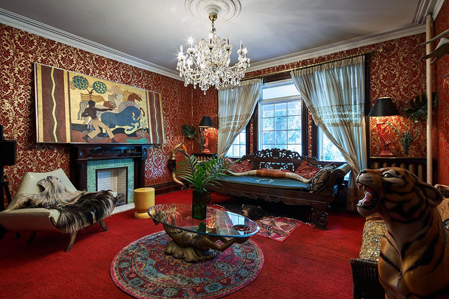

Then there’s 101-year-old fashion icon Iris Apfel, known for her over-the-top style, who launched a collaboration with the washable-carpet company Ruggable, featuring her splashy signature prints. After Martha Stewart Living magazine – the spiritual home of tasteful pale paint and white picket fences for more than 30 years – ceased publishing last year, Stewart’s website jumped on the colour saturation bandwagon with a story advocating “colour drenching,” where a strong hue is used absolutely everywhere in a room to pack a monochromatic punch. Plus, don’t underestimate the Barbie movie’s potential for a vibrant knock-on effect, with its throwback to candy pink and a Palm Springs vibe circa the 1950s, which House Beautiful predicts will lead to a Barbiecore decor trend.
Like haute couture trickling down from the runway to the mall, these lofty interior design experiments influence what is going on in our homes. Every era has a design identity, from the mod ’60s, with its pop-art primary palette, through the duskier browns of the hippie ’70s, the cartoonish bold colours of the industrial ’80s, the earthy tones of grunge in the ’90s, to the millennium’s dusty pink phase, all before the white, open-space farmhouse style came into the picture.
In the early 2020s, we’re starting to see warmer undertones for whites and other neutrals, with beige replacing grey, for example, and pops of saturated colour in browns, reds and greens. There is renewed interest in natural finishes, after concrete and stainless-steel ruled interiors for years. Biophilic design – the concept of connecting interiors to nature by adding plants, increasing natural light and damping down the intrusive sounds of modern life – is another overarching trend.
Pantone, the company known for its colour matching library and trend forecasting, and the paint manufacturers pick colours of the year at least a year in advance, taking into account everything from the economy to social-media fixations, fashion and politics. This year Benjamin Moore selected Raspberry Blush, an orangey red, representing “electric optimism.” Pantone’s 2023 pick, Viva Magenta, was in the red family, too, which the company called “brave and fearless,” and a “pulsating colour whose exuberance promotes a joyous and optimistic celebration, writing a new narrative.” Certainly sounds post-pandemic to me!
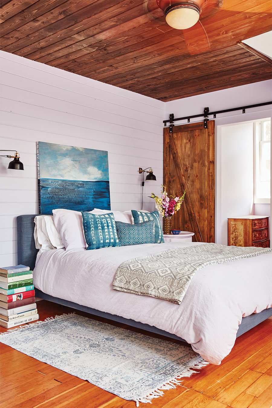
A transition to colour and pattern and texture is easier to do all at once, and I speak from experience. Last year, as the world emerged from the pandemic with a sense of optimism, I decorated my century-old farmhouse. It was daunting – a big blank canvas will always give one pause – but working out an entire colour scheme at once was very satisfying. I knew I didn’t want to do farmhouse white with black trim. I wanted something cosy, yet modern, and paint – an affordable luxury – was the means to that end. But choosing colour intimidates me, for fear of an expensive mistake. So I am grateful to have a dear friend, Toronto writer Karen von Hahn, who has a design background and a flawless eye for colour. We went bananas choosing paint chips, and for the first time, I got really excited about the project. I knew I wanted a different vibrant pastel for each of the four sunny, upstairs bedrooms (which would make it easier for guests to differentiate the spaces), and Easter egg colours would reflect the light.

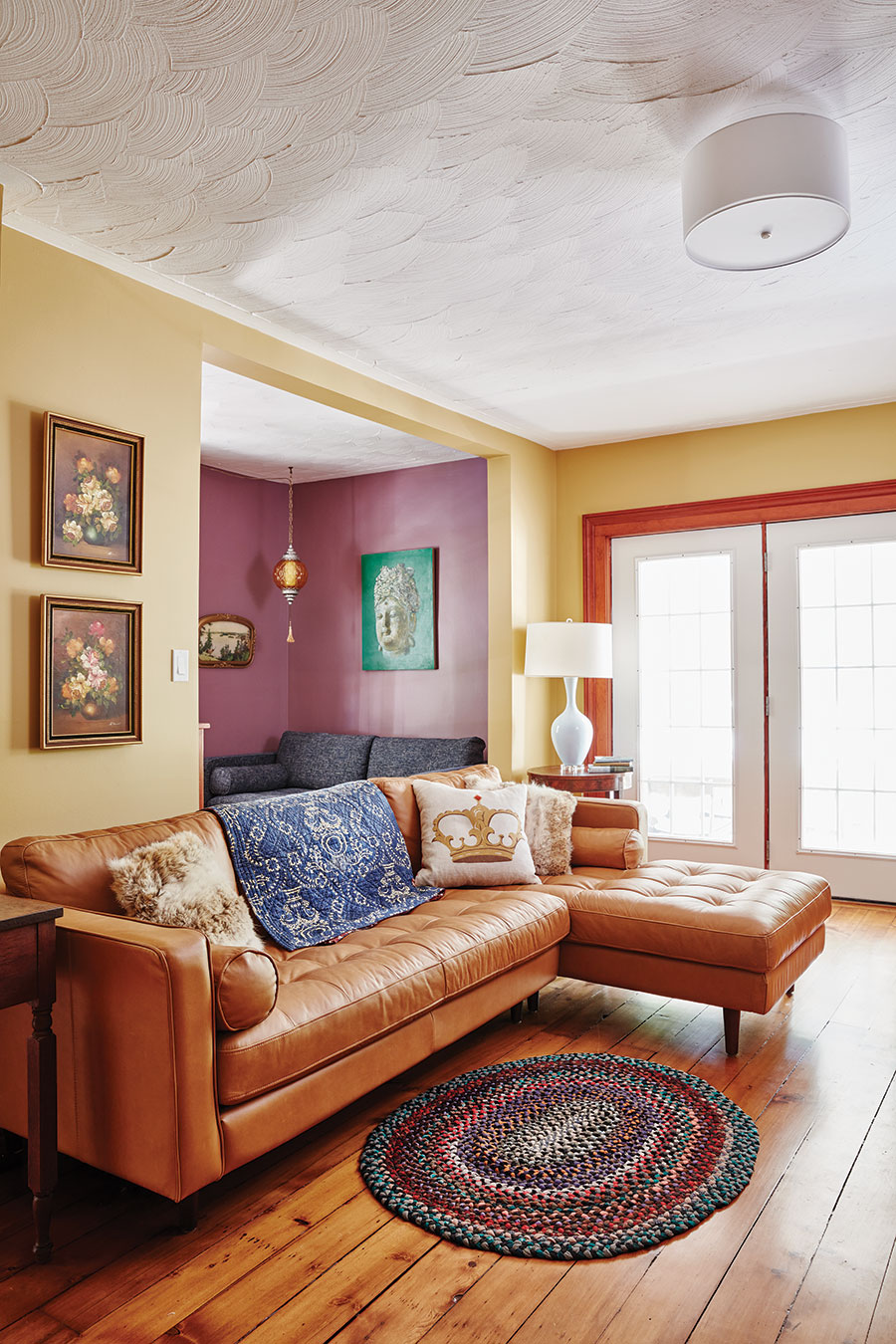
Downstairs, which is much darker because we kept the original windows – built in an era more about function than fashion – we built a palette around the green kitchen and the mustard gold living room. Once we picked out the accent colours for adjacent rooms (plum and a turquoise close enough to peacock blue), we realized we were building around Clue characters, which felt like the right theme to add an element of mystery and retro British country-house glamour. I will have to play the role of Miss Scarlet myself.
Funnily enough, the Azores turquoise von Hahn chose for the front hall was the exact same colour picked later by Benjamin Moore ambassador Mystic Michaela, who read my aura during a consultation. (It was very moving, because she literally saw past trauma around me, and it turns out I need turquoise as a colour antidote, for healing purposes.) “A cool turquoise that sits between green and blue, this old soul features the sensitive nature of turquoise, with the intellectualism of a green aura,” she says.
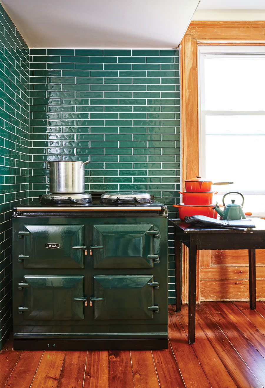
The emotionality of colour – how it makes you feel in a room – intrigued me, so I followed up on my bold choices with Sharon Grech, the colour and marketing manager for Benjamin Moore paints in Canada. She says nature is a big influencer, and the many greens in my kitchen – chosen to match the big AGA cooker I had shipped over from England – draw on this “naturally balanced and grounded hue that so many of us are drawn to right now, as it can be restful, nurturing, yet also invigorating.” All greens go together, and, as nature’s background tone, it also goes with most other colours.
You have to choose hues that flow from room to room with “harmony and colour flow.” In analyzing my choices, Grech says they work together because they all have the same depth of tone. For the living room and back hall, she says Citrine, a deep golden mustard, is “cheerful,” but “it can also be meditative – in so many cultures it is symbolic of the sun, life-giving and energizing, ultimate warmth.”
I chose Pale Moon for one bedroom, and Lavender Ice for the front bedroom that faces south, which is a counterpoint to the deep plum in the library. Grech says purple is a “love or hate” colour – one of the more divisive shades on the wheel – and a dichotomy of warm red and cool blue opposites. It is also a spiritual colour. I’m a love-it person.
The big splurge on the farmhouse project was the $8,000 I spent on wallpaper, which is making a comeback with the swing toward exuberance in interiors. I had been stalking a new Canadian wallpaper art company,Fine & Dandy Co., as its grand, contiguous murals started appearing in decor magazines.

Their wallpaper blew up as COVID-19 was spreading, when people were spending more time indoors reinventing their homes. Interest peaked in their “interactive, immersive, grand and lofty” wall coverings, says Carla Morano, Fine & Dandy Co. co-founder and chief of marketing. Colour and pattern “are a good snapshot of social temperature. People want to feel joy and happiness in their home.”
You can see the company’s work in Toronto’s Darling Mansion, the Chloe Hotel in New Orleans and Guild House Hotel in Philadelphia, but recently Fine & Dandy scooped the ultimate dream job. “We installed a complete mural wrap at the Falconer’s Cottage in Versailles,” says chief creative officer Shelley Weinreb, referring to the French palace built in the 17th century by Louis XIV.
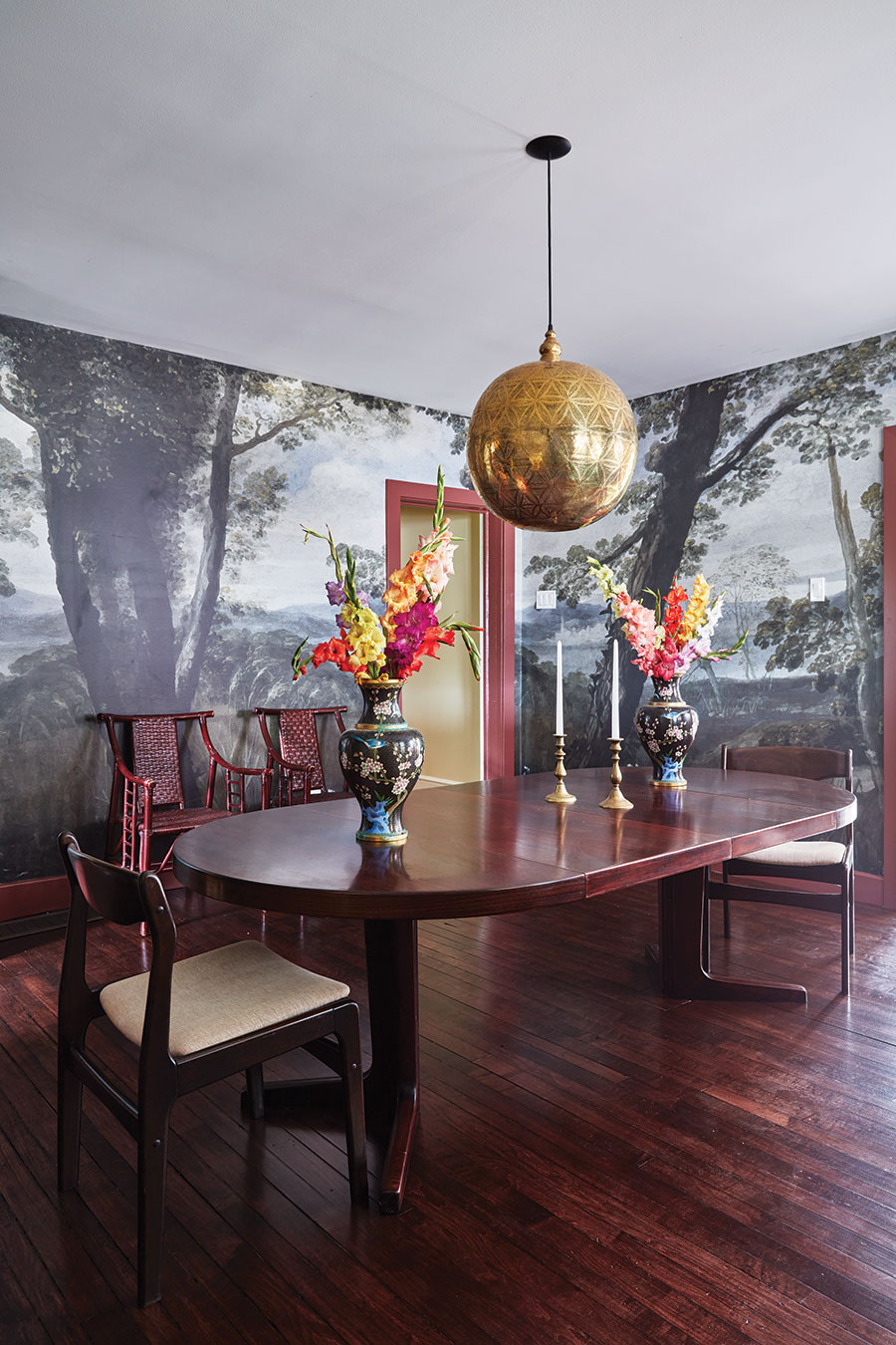
For my large, square dining room, which is very dim, I doubled down on drama with a mural from the company’s Imaginarium collection: a dark, dream-like forest scene that brings the woods surrounding our farmhouse inside. I’ve never been so nervous placing an order, but the effect is otherworldly and transporting.
Trends notwithstanding, interior design is all about rejoicing in your personal expression and individual style, which will speak to boomers, a generation of nonconformists who questioned the status quo. What is cool now is being yourself, in your own home.
A version this article appeared in the Aug/Sept 2023 issue with the headline ‘The Bold & The Beautiful’, p. 74.
RELATED:
6 DIY (and Inexpensive) Home Decor Hacks
Living Off-the-Grid: How One Couple’s Dream of Creating a ‘Floating Cottage’ Turned Into a Business
'%3E %3Cg id='Group'%3E %3Cpath id='Vector_2' d='M12.4876 13.8996V13.4213H0.743091V15.2149H9.18805L9.22196 15.2685C9.19653 15.2272 3.24373 25.2836 0.74521 29.5469C0.420975 30.1015 0.0797856 30.7158 0.0797856 30.7158C0.0713089 30.7323 0.0585938 30.755 0.0585938 30.755H12.1401V28.9614H3.67181L3.6379 28.9078C3.37512 29.1222 12.4876 13.8996 12.4876 13.8996ZM36.1229 22.115C36.1229 26.4896 33.7537 29.18 31.1683 29.18C28.5829 29.18 26.1861 26.4896 26.1861 22.115C26.1861 17.7403 28.5553 15.0231 31.1683 15.0231C33.7812 15.0231 36.1229 17.7403 36.1229 22.115ZM22.0155 22.115C22.0155 26.4896 19.6462 29.18 17.0587 29.18C14.4712 29.18 12.0765 26.4896 12.0765 22.115C12.0765 17.7403 14.4458 15.0231 17.0587 15.0231C19.6717 15.0231 22.0155 17.7403 22.0155 22.115ZM38.223 22.0613C38.223 16.7095 35.0443 13.1492 31.1661 13.1492C27.288 13.1492 24.3402 16.4312 24.0987 21.4326C23.8592 16.4333 20.7842 13.1492 17.0587 13.1492C13.3332 13.1492 9.97427 16.7074 9.97427 22.0613C9.97427 27.4153 13.1785 31.0003 17.0587 31.0003C20.9389 31.0003 23.8592 27.7183 24.0987 22.6922C24.3402 27.7162 27.4406 31.0003 31.1661 31.0003C34.8917 31.0003 38.223 27.4421 38.223 22.0613ZM51.3747 30.755H53.5257L52.3178 13.4213H50.1668L45.797 27.3328L41.4273 13.4213H39.2763L38.0662 30.755H40.2172L41.0352 19.0247L44.7205 30.755H46.8714L50.5567 19.0247L51.3747 30.755ZM53.9453 30.755H62.3797V28.9614H56.0963V22.9293H60.964V21.1357H56.0963V15.2128H61.8859V13.4192H53.9453V30.7529V30.755ZM69.3624 18.2021C69.3624 20.1029 68.1333 21.1625 66.7367 21.1625H64.893V15.2128H66.7092C68.1333 15.2128 69.3624 16.3261 69.3624 18.2021ZM71.5134 18.1753C71.5134 15.2128 69.3348 13.4213 67.0164 13.4213H62.7993V30.755H64.893V22.9313H66.7092L71.5112 30.755H73.997L68.8601 22.4695C70.369 21.8717 71.5134 20.3502 71.5134 18.1773' fill='%23231F20'/%3E %3C/g%3E %3C/g%3E %3C/g%3E %3Cg id='Group_2'%3E %3Cpath id='Vector_3' d='M9.67285 8.56629V3.50513H12.6249V4.11535H10.5947V5.71719H12.2943V6.32742H10.5947V7.954H12.9046V8.56423H9.67285V8.56629Z' fill='%23231F20'/%3E %3Cpath id='Vector_4' d='M17.6819 8.6137H17.2581L15.1855 3.50513H16.1392L17.0822 5.86975C17.2178 6.20991 17.362 6.63872 17.4976 7.05103H17.5188C17.6544 6.64696 17.7879 6.2264 17.9341 5.86975L18.8666 3.50513H19.7482L17.6862 8.6137H17.6819Z' fill='%23231F20'/%3E %3Cpath id='Vector_5' d='M22.4072 8.56629V3.50513H25.3593V4.11535H23.3291V5.71719H25.0287V6.32742H23.3291V7.954H25.639V8.56423H22.4072V8.56629Z' fill='%23231F20'/%3E %3Cpath id='Vector_6' d='M31.6164 8.56629L29.9698 6.32123H29.2959V8.56629H28.374V3.50513H30.0948C30.9552 3.50513 31.805 4.01227 31.805 4.90906C31.805 5.54402 31.3896 5.97283 30.8725 6.16249L32.6654 8.56629H31.6185H31.6164ZM29.9592 4.10711H29.2959V5.71719H29.9592C30.436 5.71719 30.8704 5.43888 30.8704 4.90906C30.8704 4.37923 30.436 4.10711 29.9592 4.10711Z' fill='%23231F20'/%3E %3Cpath id='Vector_7' d='M37.5849 6.27382V8.56629H36.6737V6.28206L34.6943 3.50513H35.667L36.6503 4.90081C36.8156 5.13789 37.0021 5.38528 37.1378 5.59968H37.159C37.3031 5.39353 37.5001 5.11522 37.657 4.90081L38.6403 3.50513H39.5621L37.5828 6.27382H37.5849Z' fill='%23231F20'/%3E %3Cpath id='Vector_8' d='M44.3084 4.11535V8.56629H43.376V4.11535H41.7188V3.50513H45.9656V4.11535H44.3084Z' fill='%23231F20'/%3E %3Cpath id='Vector_9' d='M52.0484 8.56629V6.32948H49.499V8.56629H48.5771V3.50513H49.499V5.71926H52.0484V3.50513H52.9808V8.56629H52.0484Z' fill='%23231F20'/%3E %3Cpath id='Vector_10' d='M56.2129 8.56629V3.50513H57.1453V8.56629H56.2129Z' fill='%23231F20'/%3E %3Cpath id='Vector_11' d='M64.7402 8.64463L62.4091 6.17693C62.0467 5.79553 61.6208 5.31106 61.2796 4.91524L61.2584 4.92349C61.2796 5.3523 61.2902 5.7811 61.2902 6.13776V8.56629H60.3789V3.50513H61.0316L63.1868 5.82233C63.4878 6.14806 63.9222 6.63872 64.2337 7.00362L64.2549 6.99537C64.2337 6.62223 64.2231 6.17899 64.2231 5.83677V3.50513H65.1344V8.64669H64.7402V8.64463Z' fill='%23231F20'/%3E %3Cpath id='Vector_12' d='M70.9048 8.64416C69.4235 8.64416 68.0566 7.69172 68.0566 6.03421C68.0566 4.37671 69.4659 3.41602 70.8752 3.41602C71.5999 3.41602 72.17 3.57476 72.5324 3.78091L72.3883 4.42412C72.0471 4.21797 71.5491 4.05098 71.0002 4.05098C69.9639 4.05098 68.9912 4.77253 68.9912 6.04246C68.9912 7.31239 69.9448 8.01745 70.9599 8.01745C71.405 8.01745 71.7567 7.93911 71.975 7.7948V6.61352H70.8349V6.03421H72.8354V8.12877C72.3586 8.47718 71.7271 8.64416 70.9091 8.64416H70.9048Z' fill='%23231F20'/%3E %3C/g%3E %3Cpath id='Vector_13' d='M0.0839844 1.00212L73.997 1' stroke='%23231F20' stroke-width='1.25' stroke-miterlimit='10'/%3E %3Cpath id='Vector_14' d='M0.0839844 10.9116H73.997' stroke='%23231F20' stroke-width='1.25' stroke-miterlimit='10'/%3E %3Cpath id='Vector_15' d='M4.91016 4.15649L3.55812 4.13794L5.18777 5.7068L0 5.6532V6.5974L5.20049 6.651L3.61321 8.18068L4.96526 8.19718L7.0018 6.20157L4.91016 4.15649Z' fill='%23D71920'/%3E %3C/g%3E %3C/svg%3E)
